A very visual update today on our new Artful default session! This one is, as promised about our new GNOME Shell theme and you can see below some examples of those changes. For more background on this, you can refer back to our decisions regarding our default session experience as discussed in my blog post.
Day 9: Uploading new theme changes
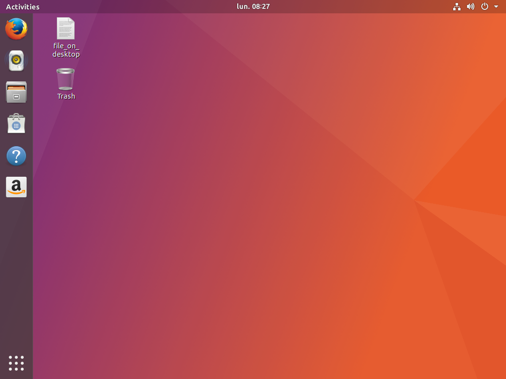
As I reported a little bit more than a week ago, the Fit and Finish Sprint went well and we have tackle some important areas of changes. You can see a summary in our trello board that a lot happened already. Martin is reviewing and merging some fixes on our GTK ambiance and radiance themes (but no big visual updates, just small refinements and performance fixes). This task is still ongoing. I’ll focus here on the Shell theme changes that are now available. Here is our the new default theme:

As you can see here, we are based on GNOME Shell 3.25.91 (upcoming GNOME 3.26), which presents, for now, a transparent top panel until you have an application touching it. We followed thus that trend, knowing that there are upstream discussions around readability issues due to lack of real blur and the upstream GNOME team may revert that change before 3.26 final. We will follow whatever decision taken there: if the panel is kept transparent, we will probably have to adapt slightely the Ubuntu Dock rendering with it.
The main changes are way more visible once you maximize an application or have any title bar touching the top panel:
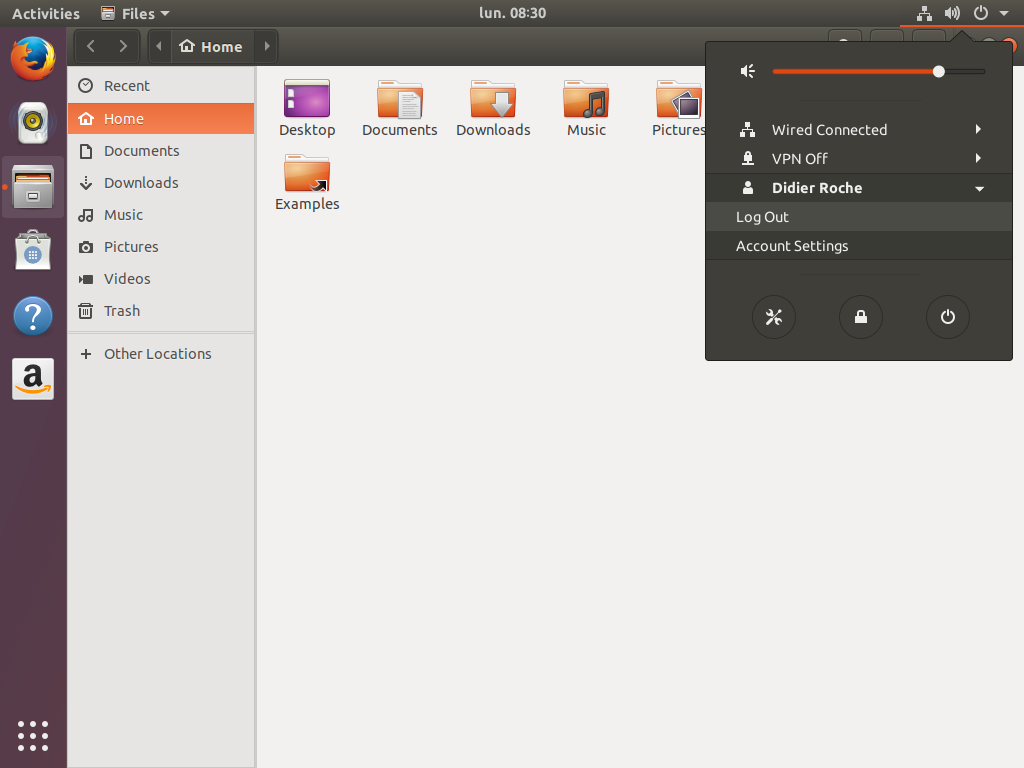
For reference, the previous state was state one:
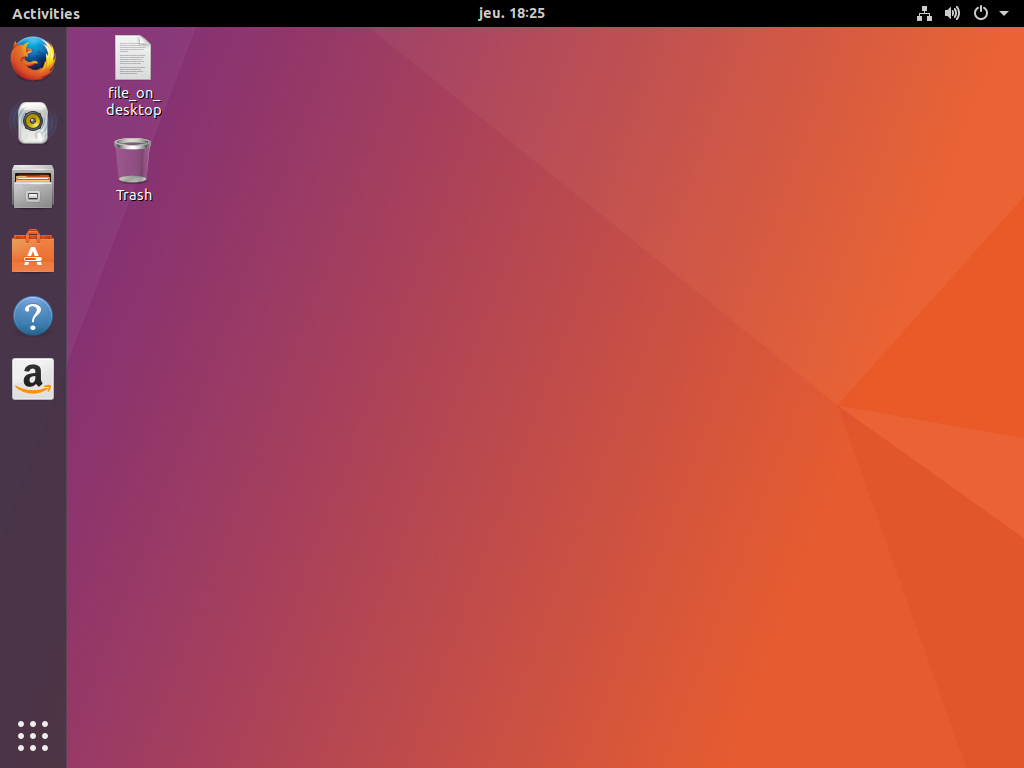
The most noticeable change compared on the upstream one is the top panel gradient, matching our title bar style. It was commonly shared by the community, from comments on this blog posts and other popular community forums that the black top panel was slightly mismatch when a gradient title bar was next to it. Back on the same feedbacks, rounded corners became straight. Indeed, with nautilus displaying the background wallpapers for icons on desktop, and the panel being a gradient instead of pure black, the rounded corner seemed misplaced (dark/black uniform corner). We thus adapted this and removed the matching rounded shadow when maximizing an application.
All grey colors are moved from a blue-grey to an orange-style grey. This is particularly visible in the menus, separators, buttons, on screen display (volume keys, workspace switcher…), notifications, modal dialogs…

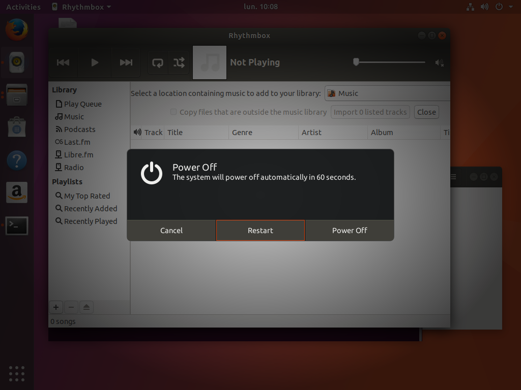
Any clicks on any button displays a matching orange color:
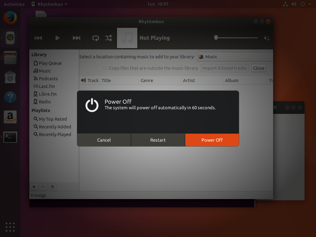
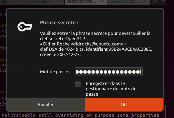
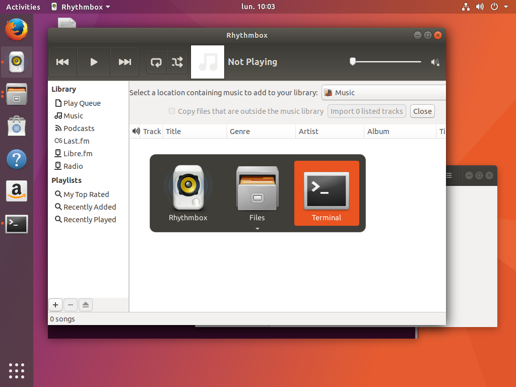
Alt-tab got also some refinements:
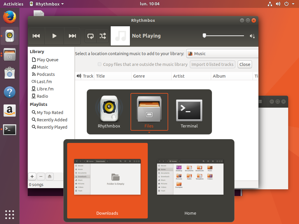
You will notice the little arrow colors and style change when you go into “select window mode”:
The overview now hold a close button matching our theme, alongside the selection for windows/workspaces:
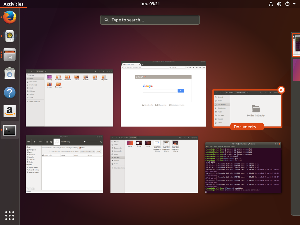
The new search presentation from upcoming GNOME Shell 2.26 has also got some love:
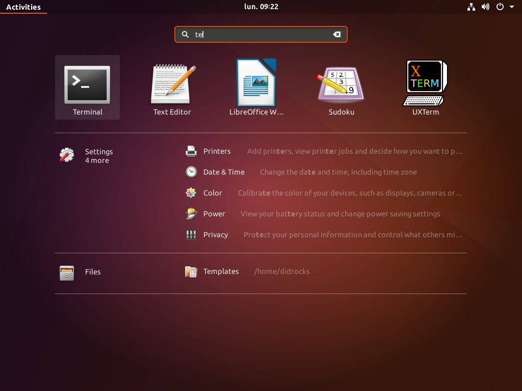
Another change we did around the same time is to change Ubuntu Dock default to present a live preview from any application windows.
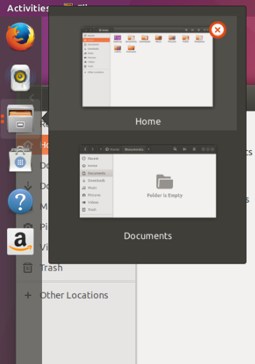
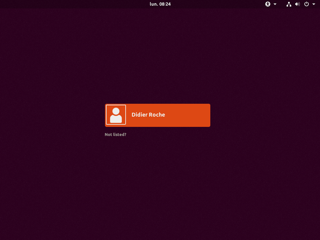
We worked also on a visual continuity from our boot and login experience. For the GDM theme (which can’t be change easily by the user as it’s part of the Shell css), we thus decided to take the same color than our plymouth boot screen, using the upstream noise graphic layer effect:
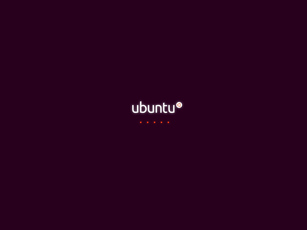
Selecting a session matches the same color scheme:
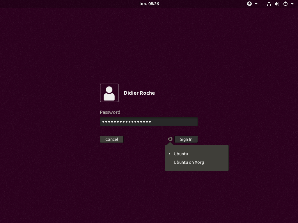
Note that another patch was needed to keep the same color when the Shell is booting up. The upstream grey is hardcoded in the javascript file and thus we got a “grey” flash on boot. We wanted to prevent that (based per session) via a small patch. We’ll work upstream on a better way to solve that (like, reading the css property, if possible).
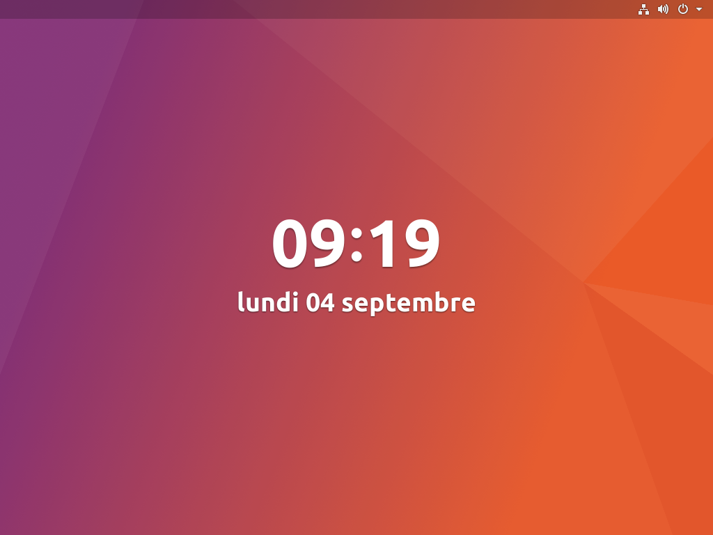
The lock screen has the same slight panel shadow (the lock screen wallpaper can be changed in GNOME Control Center):
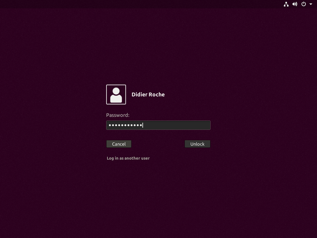
For maintainability purposes, apart from some color rotations on the grey and straight color changes, we mostly use overrides in our ubuntu.css file for the presentation we wanted to change.
However, some source colors are sometimes matching multiple destinations: that prevented us to work straight from the sass files. We plan to get that enhanced next cycle working in upstream GNOME on theming.
If accessibility is turned on, we just rely on the awesome upstream high contrast GTK and Shell themes:
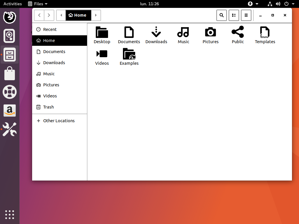
As usual, the default GNOME Vanilla session kept its own upstream theming (apart from the GDM screen, which is system-wide).
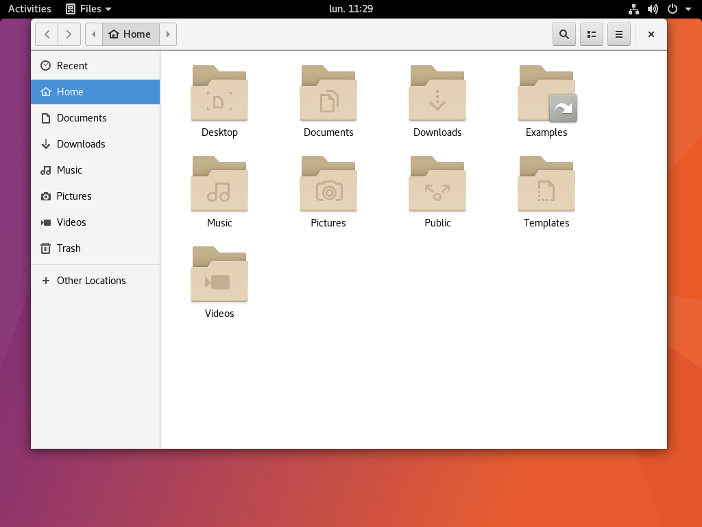
Some issues are known under Wayland, like the presence of a blurry font. We (probably Daniel) will tackle this bug (and other performance related) before release. :)
As every day, if you are eager to experiment with these changes before they migrate to the artful release pocket, you can head over to our official Ubuntu desktop team transitions ppa to get a taste of what’s cooking!
Also, the Shell theme is only available for Ambiance right now. We didn’t tackle a Radiance compatible theme yet. Knowing that GNOME Control Center doesn’t allow you selecting a theme, it’s probably something that we’ll bring back, with adapting the Shell to the correct theme. However, this is quite some work at this stage of the cycle and we aren’t sure we’ll have time for doing this before the 17.10. We have a lot of other gotchas and important bugs to tackle first! Any help from the community around those areas are more than welcome, either contact us on #ubuntu-desktop (IRC/freenode) or via the buntu Desktop mailing list if you are interested and have CSS and/or C skills!
