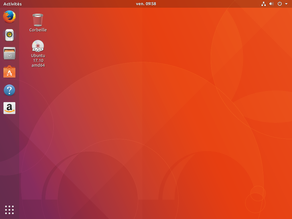
Since the Ubuntu Rally in New York, the Ubuntu desktop team is full speed ahead on the latest improvements we can make to our 17.10 Ubuntu release, Artful Aardvark. Last Thursday was our Final Freeze and I think it’s a good time to reflect some of the changes and fixes that happened during the rally and the following weeks. This list isn’t exhaustive at all, of course, and only cover partially changes in our default desktop session, featuring GNOME Shell by default. For more background on our current transition to GNOME Shell in artful, you can refer back to our decisions regarding our default session experience as discussed in my blog post.
Day 15: Final desktop polish before 17.10 is out
GNOME 3.26.1
Most of you would have noticed already, but most of GNOME modules have been updated to their 3.26.1 release. This means that Ubuntu 17.10 users will be able to enjoy the latest and greatest from the GNOME project. It’s been fun to follow again the latest development release, report bugs, catch up regressions and following new features.
GNOME 3.26.1 introduces in addition to many bug fixes, improvements, documentation and translation, updates resizeable tiling support, which is a great feature that many people will surely take advantage of! Here is the video that Georges has done and blogged about while developing the feature for those who didn’t have a look yet:
A quick Ubuntu Dock fix rampage
I’ve already praised here many times the excellent Dash to Dock upstream for their responsiveness and friendliness. A nice illustration of this occurred during the Rally. Nathan grabbed me in the Desktop room and asked if a particular dock behavior was desired (scrolling on the edge switching between workspaces). First time I was hearing that feature and finding the behavior being possibly confusing, I pointed him to the upstream bug tracker where he filed a bug report. Even before I pinged upstream about it, they noticed the report and engaged the discussion. We came to the conclusion the behavior is unpredictable for most users and the fix was quickly in, which we backported in our own Ubuntu Dock as well with some other glitch fixes.
The funny part is that Chris witnessed this, and reported that particular awesome cooperation effort in a recent Linux Unplugged show.
Theme fixes and suggested actions
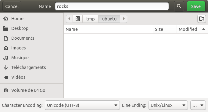
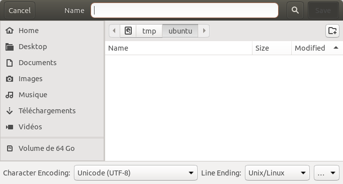
With our transition to GNOME Shell, we are following thus more closely GNOME upstream philosophy and dropped our headerbar patches. Indeed, as we previously, for Unity vertical space optimizations paradigm with stripping the title bar and menus for maximized applications, distro-patched a lot of GNOME apps to revert the large headerbar. This isn’t the case anymore. However, it created a different class of issues: action buttons are generally now on the top and not noticeable with our Ambiance/Radiance themes.
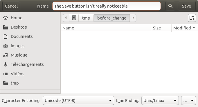
We thus introduced some styling for the suggested action, which will consequently makes other buttons noticeable on the top button (this is how upstream Adwaita theme implements it as well). After a lot of discussions on what color to use (we tied of course different shades of orange, aubergine…), working with Daniel from Elementary (proof!), Matthew suggested to use the green color from the retired Ubuntu Touch color palette, which is the best fit we could ever came up with ourself. After some gradient work to make it match our theme, and some post-upload fixes for various states (thanks to Amr for reporting some bugs on them so quickly which forced me to fix them during my flight back home :p). We hope that this change will help users getting into the habit to look for actions in the GNOME headerbars.
But That’s not all on the theme front! A lot of people were complaining about the double gradient between the shell and the title bar. We just uploaded for the final freeze some small changes by Marco making them looking a little bit better for both titlebars, headerbars and gtk2 applications, when focused on unfocused, having one or no menus. Another change was made in GNOME Shell css to make our Ubuntu font appear a little bit less blurry than it was under Wayland. A long-term fix is under investigation by Daniel.


Settings fixes
The Dock settings panel evolved quite a lot since its first inception.
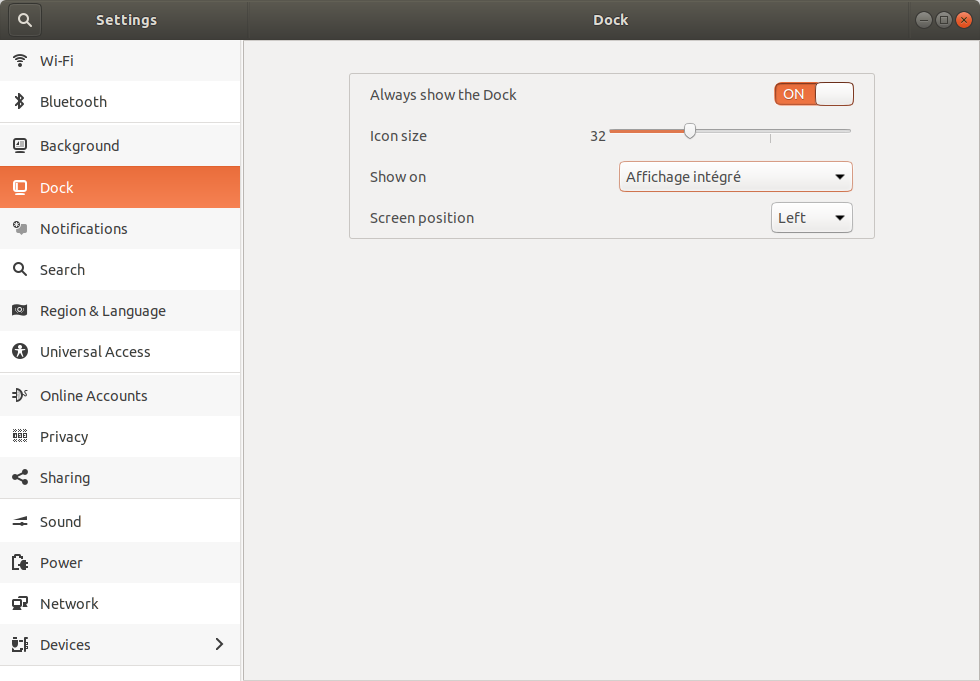
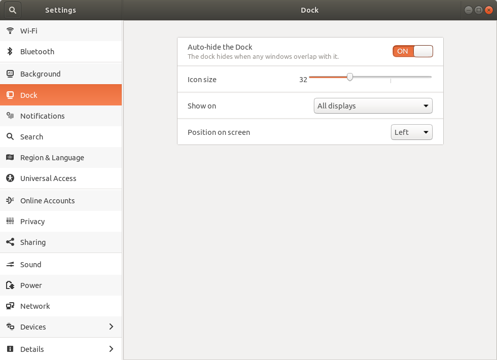
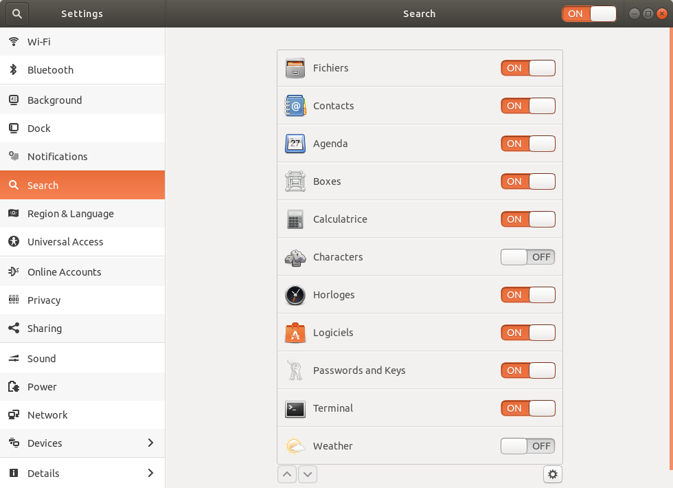
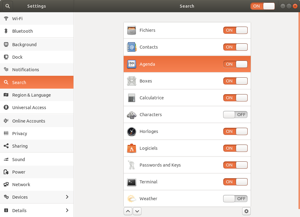
Bastien, who had worked a lot on GNOME Control Center upstream, was kindly enough to give a bunch of feedbacks. While some of them were too intrusive so late in the cycle, we implemented most of his suggestions. Of course, even if we live less than 3 kms away from each other, we collaborated as proper geeks over IRC ;)
Here is the result:
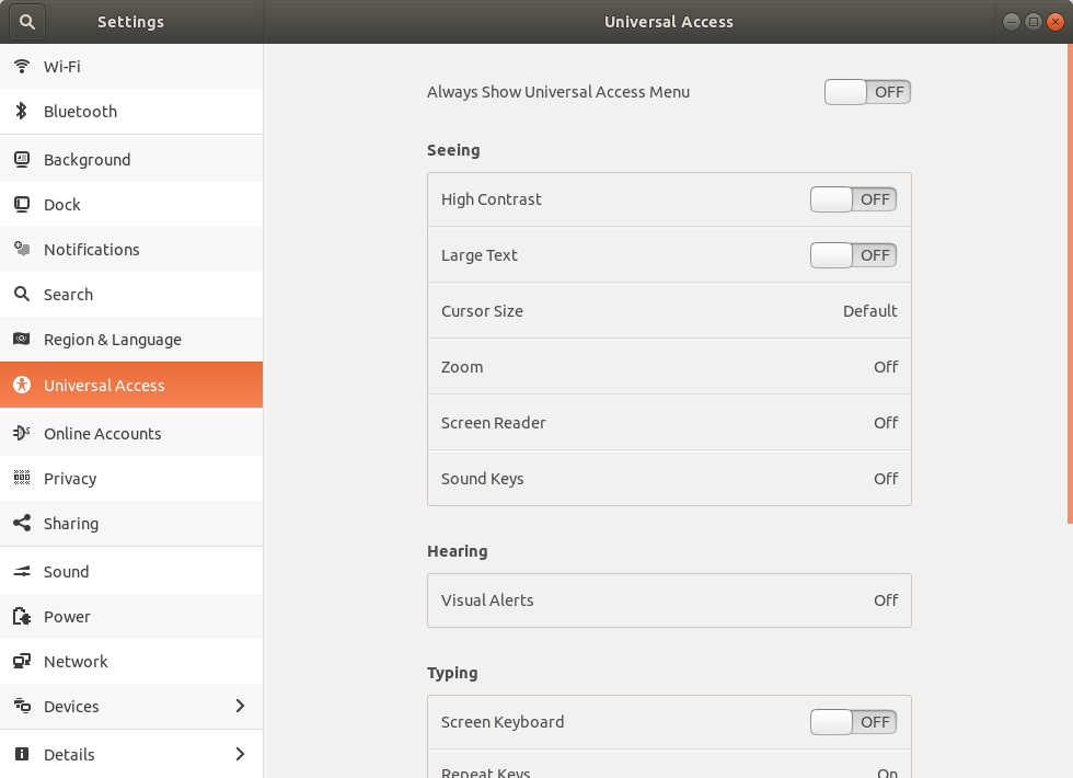
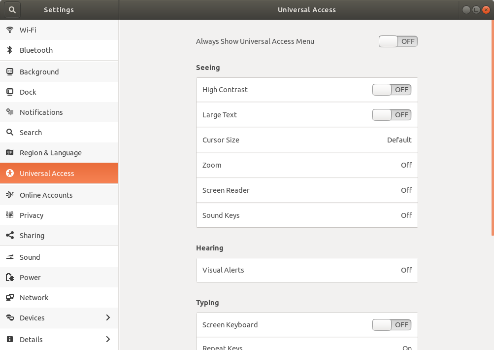
One of the best advice was to move the background for list to white (we worked on that with Sébastien), making them way more readable:
i18n fixes in the Dock and GNOME Shell
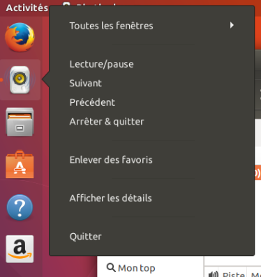
Some (but not all!) items accessible via right clicking on applications in the Ubuntu Dock, or even in the upstream Dash in the vanilla session weren’t translated.
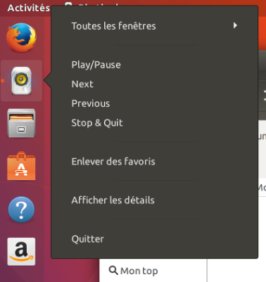
After a little bit of poking, it appeared that only the Desktop Actions were impacted (what we called “static quicklist” in the Unity world). Those were standardized some years after we introduced it in Unity in Freedesktop spec revision 1.1.
Debian, like Ubuntu is extracting translations from desktop files to include them in langpacks. Glib is thus distro-patched to load correctly those translations. However, the patch was never updated to ensure action names were returning localized strings, as few people are using those actions. After a little bit of debugging, I fixed the patch in Ubuntu and proposed back in the Debian Bug Tracking System. This is now merged for the next glib release there (as the bug impacts both Ubuntu, Debian and all its derivatives).
We weren’t impacted by this bug previously as when we introduced this in Unity, the actions weren’t standardized yet and glib wasn’t supporting it. Unity was thus directly loading the actions itself. Nice now to have fixed that bug so that other people can benefit from it, using Debian and vanilla GNOME Shell on Ubuntu or any other combinations!
Community HUB
Alan announced recently the Ubuntu community hub when we can exchange between developers, users and new contributors.
When looking at this at the sprint, I decided that it could be a nice place for the community to comment on those blog posts rather than creating another silo here. Indeed, the current series of blog post have more than 600 comments, I tried to be responsive on most of them requiring some answers, but I can’t obviously scale. Thanks to some of the community who already took the time to reply to already answered questions there! However, I think our community hub is a better place for those kind of interactions and you should see below, an automated created topic on the Desktop section of the hub corresponding to this blog post (if all goes well. Of course… it worked when we tested it ;)). This is read-only, embedded version and clicking on it should direct you to the corresponding topic on the discourse instance where you can contribute and exchange. I really hope that can foster even more participation inside the community and motivate new contributors!
(edit: seems like there is still some random issues on topic creation, for the time being, I created a topic manually and you can comment on here)
Other highlights
We got some multi-monitor fixes, HiDPI enhancements, indicator extension improvements and many others… Part of the team worked with Jonas from Red Hat on mutter and Wayland on scaling factor. It was a real pleasure to meet him and to have him tagging along during the evenings and our numerous walks throughout Manhattan as well! It was an excellent sprint followed by nice follow-up weeks.
If you want to get a little bit of taste of what happened during the Ubuntu Rally, Chris from Jupiter Broadcasting recorded some vlogs from his trip to getting there, one of them being on the event itself:
As usual, if you are eager to experiment with these changes before they migrate to the artful release pocket, you can head over to our official Ubuntu desktop team transitions ppa to get a taste of what’s cooking!
Now, it’s almost time to release 17.10 (few days ahead!), but I will probably blog about the upgrade experience in my next and last - for this cycle - report on our Ubuntu GNOME Shell transition!
Edit: As told before, feel free to comment on our community HUB as the integration below doesn’t work for now.
