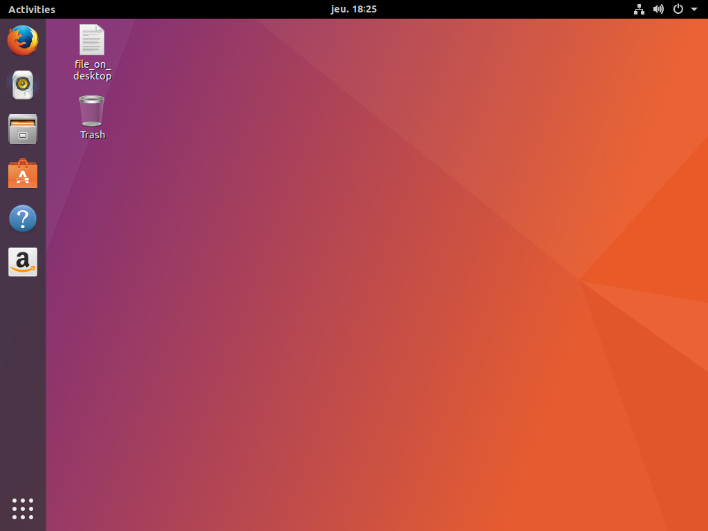
Big update today and probably a very awaited one: here is an important step on our journey on transforming the default session in Ubuntu Artful. Let’s get the new Ubuntu Dock installed by default! For more background on this, you can refer back to our decisions regarding our default session experience as discussed in my blog post.
Day 5: A dock, light fork and upstream extension discussions.
Today is THE day. After upgrading (and all things migrating), our new Ubuntu Dock should be installed by default and activated in your Ubuntu artful session. Note that of course, this is part of the GNOME Shell ubuntu mode and not enabled in the GNOME vanilla session.
It’s looking like this by default, thanks to the changes in those 6 packages:

Ubuntu Dock is a light fork of Dash to Dock, with very few tweaks that I’ll highlight in this post.
I guess the first question is “why shipping a dock by default”?
We want to ease our user base migration from the Unity experience to a GNOME Shell one as much as possible. Those have two angles: we will deliver a really different default environment, but still need to balance that with the level of familiarity and comforts they are used to get to smooth this transition.
Our user survey results clearly demonstrated that Ubuntu users value having a dock as part of their desktop shell. The extension is bringing back that feature to our desktop.
Dash to Dock seems to be one of the most popular dock extension for the Shell, and very well maintained. It seemed logical to base on that great work and the Ubuntu Desktop team is committed to do the required maintenance work on our spin off. We thus contacted some weeks ago the main upstream developer, Michele, with whom we started to get very great conversation.
Ok, so, why you just didn’t ship Dash to Dock, but rather a light fork of it?
It’s because we like to make our life difficult and complicated of course… :)
Ok, more seriously, there are a couple of reasons for that:
- This extension is installed by default on Ubuntu. It means it needs to come from a package, in main, from the ubuntu archive. We thus need to package it first.
- If our extension kept the same GNOME Shell extension ID than Dash to Dock, it would mean that any users can upgrade it as soon a new release of Dash to Dock reached the GNOME Shell extensions website. This would bypass all our QA & security procedures and checks (remember that Ubuntu Desktop is supporting it and you have regular bug fixes and security updates) by enabling another source of update. Once people update from the website, it’s in their local user directory and no system update can override this, potentially having a stalled, version they installed. That’s the reason why we are not going to publish Ubuntu Dock on the GNOME Shell extensions website, as people who may want install from it can just install Dash to Dock, gaining the same features (and more!).
- Once released in an ubuntu version, only bug fixes, but no behavior or new defaults are allowed for UI and behavior stability are permitted. An online extension without multiple versions tracking doesn’t allow us to control that.
- We wanted to give a very lightly modified experience for our own dock, both in terms of defaults and configurability.
Note that both Michele and other contributors of Dash to Dock reached out, understood all those 4 points and encouraged us as well going on that path.
How did you operate this light fork?
We thus decided to create a different branch of the same extension that is even available in the upstream repository! This branch, containing our modifications, will be regularly rebased on top of the upstream Dash to Dock one and kept in the same repository, alongside the upstream code. I guess that’s a strong testimonial of the great collaboration that is starting between our two teams. Also, that will ensure we keep a fresh code, close to upstream.
We even already proposed some modifications that were needed for the Ubuntu Dock package but compatible with upstream code that are now in upstream Dash to Dock itself, more of that in the following weeks!
It’s really great to see that some people even started to contribute to our version, but we’ll encourage them, when the changes are compatible with Dash to Dock itself, to directly push them there. That’s why we are really keen on using a single repo with a different branch. Michele is currently working out giving some of us direct access to that “ubuntu-dock” branch so that we don’t have to keep our current one separately.
What did you change in Ubuntu Dock?
We didn’t want to bring back the full Unity experience. However, we reviewed some of our user testing research results that we conducted in the past to understand what made Unity Unity. We have also shared those user testing results with the GNOME design team and at GUADEC Matthew explained what, for example, led to the indicators philosophy. What constitutes the ubuntu dock today are the key points we identified from those years of experience.
Basically, Ubuntu Dock is a version of Dash to Dock with different defaults:
- The less visible change but more important one is probably the extension ID, description and such, to separate our dock from Dash to Dock as explained previously.
- The dock is always visible by default, taking full height and reduced spaces between icons, a little bit less opaque than the default. It has a fixed width (not depending on the number of applications pinned or running), and uses Ubuntu colored orange pips to denote running apps. If the dock is set to intellhide mode, it’s taking every windows on the workspace into account and not only the currently focused one.
- We disabled the settings panel and expose some of those settings in GNOME Control Center. More on settings in the next section.
- We did change the scrolling behavior on the application picker button to change workspace thanks to some suggestions on the french forum, which is the default upstream dash behavior for GNOME, but not Dash to Dock. That way, we have a similar user experience than vanilla GNOME.
Those behavior changes are implemented as a gsettings schema override. We wanted to keep the settings compatible with upstream Dash to Dock to ease maintenance as well as user configurability. As a user-installed dock extension has their own compiled schemas, this was easily doable.
Also, as the extension is enabled in our GNOME Shell mode, it can’t be easily disabled by the user. We thus introduced a final change to keep our dock compatible with Dash to Dock at runtime. It means that each docks have its own set of defaults. However, if you install and enable Dash to Dock, even with Ubuntu Dock running, Ubuntu Dock vanishes to let Dash to Dock taking over. If you change any settings there (via right clicking on the application picker button, or dconf editor/gsettings), the modifications will impact both Ubuntu Dock and Dash to Dock. Finally, if you disable Dash to Dock later on, Ubuntu Dock come back. So the two docks share any user modifications, but not their defaults! Basically, the idea is this allows the power user to go into the tweak mode by just installing that Dash to Dock extension.
We disabled as well the hot corner in our ubuntu session, using the patch proposed by Florian (GNOME Shell upstream developer) discussed on this bug report. The GNOME Shell overview is consequently only available by clicking on “Activities” (alongside regular keyboard shortcuts). Indeed, the hot corner isn’t very compatible with a dock where you can aim for the first application item, miss it and trigger the hot corner by error. As usual, we only turned it off in the ubuntu session only with the same default desktop override mechanism.
And related to this, and even more important, what we didn’t change. As much as possible we want to stay compatible with the GNOME Shell current design:
- For instance, the application picker button is kept at the bottom and not moved at the top of the dock. Indeed, the application picker button isn’t the BFB from the Unity world launching our “dash”, with a bunch of collected search items and suggestions (applications, weather, wikipedia content…), but only a convenient shortcut to see “more applications” than there are in the dock. There was no need to deviate from the GNOME Shell design on this, and so, we didn’t. In addition, it would be awkward to have “Activities”, and then, the “Application menu” just below it, as it will make more difficult for people to understand the difference between the two entries.
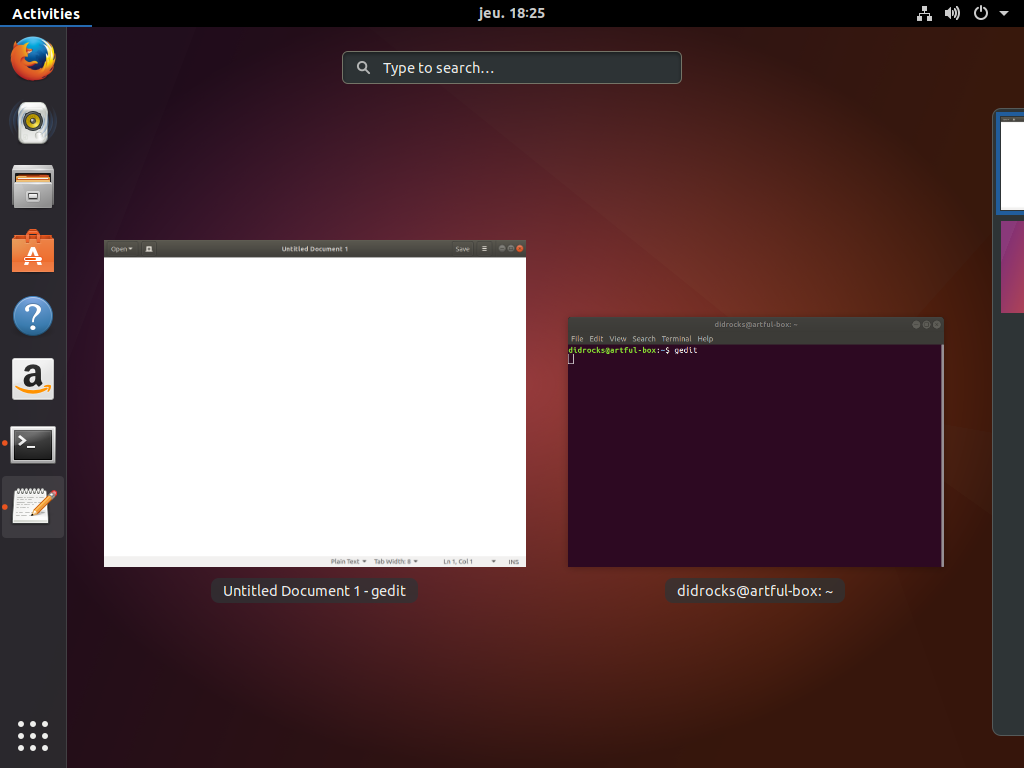 The application picker button is a “show me more apps” for when you didn’t pin or run the desired applications:
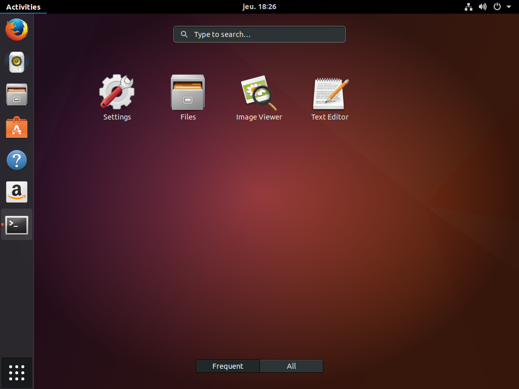
- As mentioned previously, we changed the Dash to Dock default setting on the application picker button to behave like the GNOME Shell dash application picker button: it switches between the different workspaces. One net benefit in this behavior is that the “Show desktop” feature to access desktop icons, despite not being available via a click anymore, is now easily accessible by scrolling to the last of the dynamic workspaces.
Why disable all those settings?
Both GNOME and Unity shared a common vision from the start: let’s take sane defaults, minimize the amount of user visible settings. This is why we implemented some settings in Compizconfig Settings Manager, but never shipped it by default, nor we are going to ship Tweaks by default either in artful.
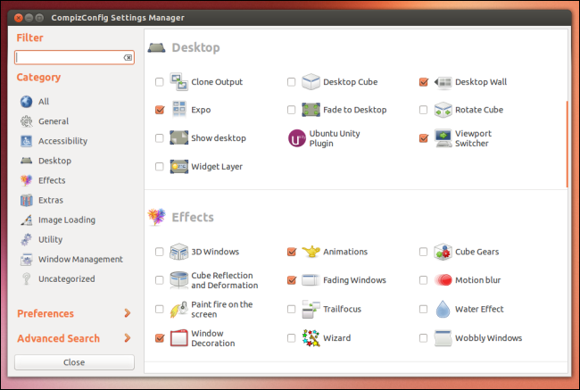
Every time you add a setting, it’s a fork in your code base. You have to test it alongside any other potential options. The more options you add, the more combinations you have to handle, the more testing is needed. Every time you add an option, you double your test cases, and thus increment from 2^n by 2^(n+1) the combinatory you have to tests. This is an explosion of test cases as not all options are compatible with each other (enabling option 1 is going to break option 2, but how can you spot that if you don’t have hours and hours of integration tests?). And let’s be honest, developers (humans…) are bad at anticipating all those incompatible settings.
Having a definitive set of settings that you think are important for the majority of your user base is the goal to better overall quality. You are in a controlled environment and know what you do.
The settings we exposed in GNOME Control Center are those corresponding to the identified set of preferences we saw in our past user testing that most people wanted to tweak and were available in previous version of Ubuntu. We did port them back and made them compatible with Ubuntu Dock (thanks to the Dash to Dock large set of settings!). Arguably, the “display panel” of GNOME Control Center isn’t the best place for those settings (is it as well the best place for the “night mode” available upstream?) but the appearance one where they were isn’t available anymore and putting them in the “background panel” didn’t sound good either. We’ll look at improving this in a future release.
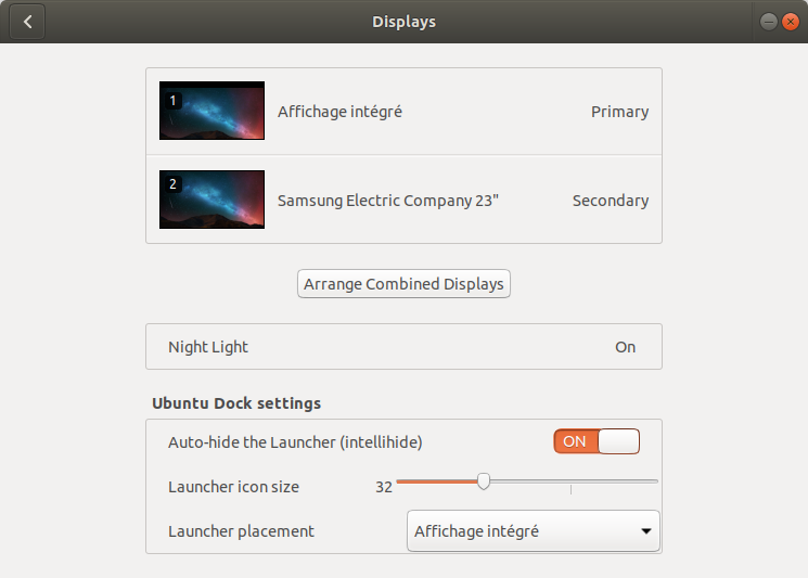
You can change here the icon size in the launcher, the Hide mode (intellihide is available) and showing the dock in all monitors or your prefered one. This impacts as well Dash to Dock if you installed it. Of course, this change is only visible under the ubuntu session, not the GNOME vanilla one.
Note that for people who will run Unity in artful, will have their own settings at the usual place in Unity Control Center.
Transitioning from Unity
As we didn’t want to let our Unity users losing some of their important settings on upgrade, we decided to migrate the ones we are exposing above (so that people can easily revert if they want) from the Unity world to this new Ubuntu session based on GNOME Shell with Ubuntu Dock enabled. This transition is done at the first user login after the upgrade occurred. I’ll write a blog post later on to detail more what we did to handle all the transitions between sessions once users upgrade to Ubuntu 17.10.
Some known issues
The biggest part of introducing this dock is now done. Of course, artful is still a development release and we know there are some corner cases to fix like this nautilus one due to introducing the dock. Also, changing back some keyboard shortcuts in Dash to Dock (but there are some bugs we’ll fix upstream) will be a nice improvement. The road is long, but it’s free. :)
To conclude
I really like Kazhnuz comment I read on this OMGUbuntu blog post, it really follows how we see Ubuntu Dock compared to Dash to Dock:
The first thing to understand with Ubuntu-Dock is what it is.
It’s not a “better dock” to Dash-to-Dock, they didn’t fork it because d-t-d wasn’t “good enough” for Ubuntu. It doesn’t aim to make you, medium or power-user want to change the dock you use. Dash-to-Dock will still be the “superior dock”, with more features for you to use, and there will be tons of tutorial to explain how to use it instead of the default dock (and Ubuntu-dock auto-disable if Dash-to-Dock is enabled). If there is any new feature they want for their dock, it’ll be certainly upstreamed in D-t-D.
They just want a simple Dock, in order to have an always visible windows list, to make their own user-base more comfortable with the new desktop.
Thanks for summing it up so well!
As every day, if you are eager to experiment with these changes before they migrate to the artful release pocket, you can head over to our official Ubuntu desktop team transitions ppa to get a taste of what’s cooking!
Enjoy playing with it over the weekend and let’s see what Monday holds on for us!
